ShopDreamUp AI ArtDreamUp
Deviation Actions


Suggested Deviants


Suggested Collections


Description
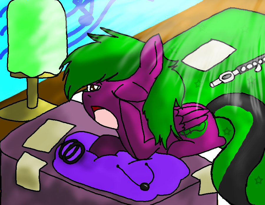
YAY FINALLY FINISHED.....very bad shading :I ill try and do better next time!
please give me a critique on the lightning :3
please give me a critique on the lightning :3
Image size
900x698px 433.13 KB
© 2012 - 2024 cluelessAvian
Comments28
Join the community to add your comment. Already a deviant? Log In
As an honest critic, please understand that I have my own opinion, and the critique button opened up my welcome to express it here to help you improve your skills. If you have a question as to why I marked the rating the way I did, please refer to my Rating information on my profile.
Let's start with anatomy. The pony's basic features makes it look like a pony, but not a very expert one. The right ear is missing, and the back left leg is not positioned right. It looks more like a dog or cat's sitting position instead of a pony's. The head looks a little too big, and the chest extends too far down, plus there is no chin. Also, the left arm seems off, and too thin at the shoulder. The lamp, I think is what it is on the table, looks crooked and positioned wrong on its base.
Then we move to the color. I like the purple and green you used for the pony, but I find it odd as to why there is black in the pony's tail, when it goes with nothing else on it. Also, the green bedding is too much the same as the green on the pony, that they blend in with each other in a way you do not want them to. I suggest making them more distinguishable from one another.
Shading and lighting is what you wanted critiqued on, and to be honest, it isn't that bad, compared to what I usually see. I tend to see it messed up and undefined, or coming from two or three different locations, so yours was pretty good. However, the way you drew it on the tail seems less clear, and the shading on the end of the bed is all over the place. Lastly on that subject, from the position this pony is at, there should be no shading on their face, nor should there be any on their front legs.
The biggest problem you have on this picture is depth. It is very undefined in this picture, especially by the instrument, papers, and pillow(?) on the bed. The instrument should have had a little bit of shading, or at least a shadow under it. Adding onto that, the chest, arm, and face seem to be connected to each other.
I hope this helped.
-Mrairs